DIVIDE
THE MODERN DIVIDE POSTER
2026
Editorial
Print Design
05
/
09
about
The Modern Divide is a poster exploring the growing difficulty of forming meaningful human connection within contemporary dating culture. Inspired by The Economist article “Why young men and women are drifting apart,” the project considers how changing expectations around gender and relationships, alongside the increasingly digital and casual nature of dating, can contribute to emotional distance and disconnection. Rather than viewing the divide simply as a conflict between men and women, I became interested in the broader ways modern culture can make people feel increasingly separate from one another.
Elijah Grimm
Source Photography
Natasha Lewis
Image Treat & Editing


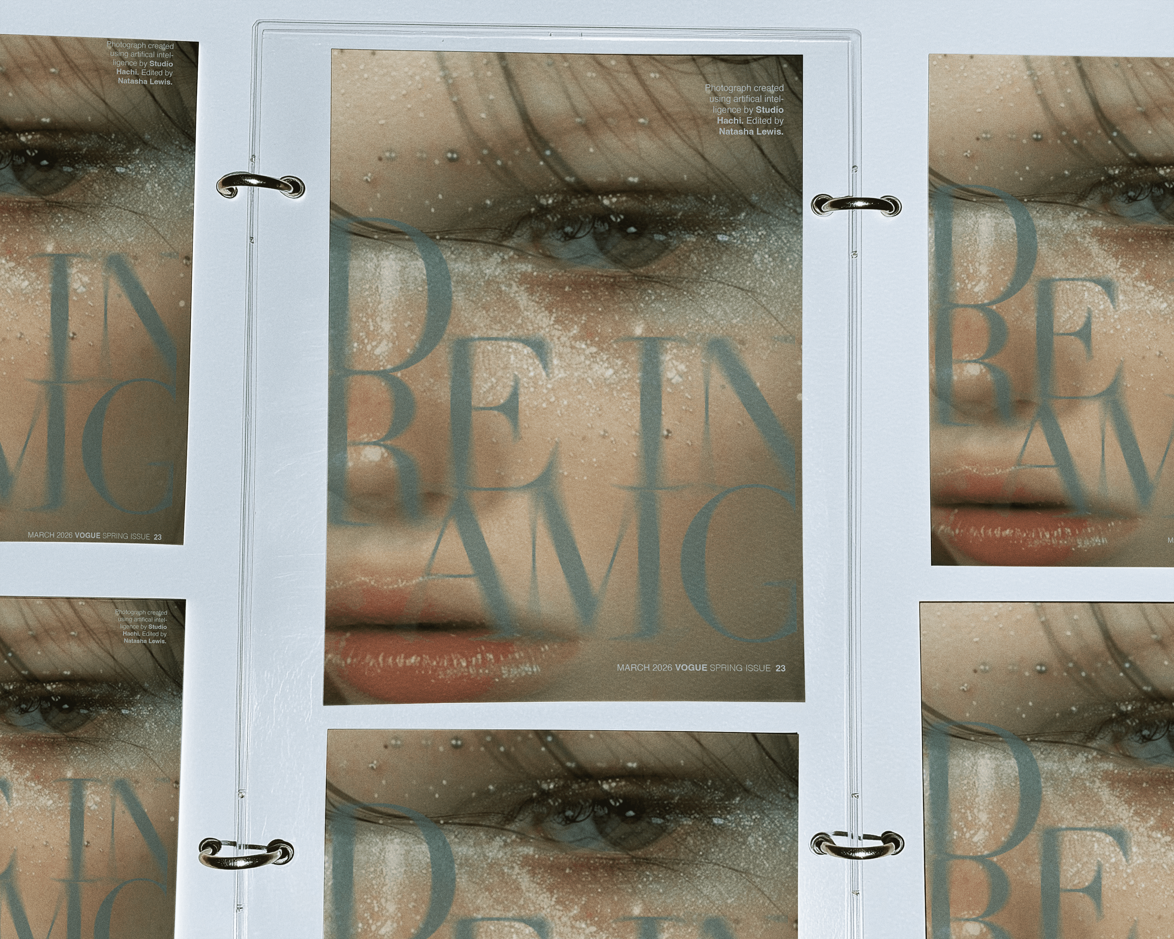
Digital dating has made it easier than ever to meet people, but ease of connection does not necessarily translate into emotional intimacy. I was interested in how the casual nature of modern dating can make vulnerability and emotional responsibility easier to avoid, and how behaviours such as ghosting can turn people into seemingly replaceable options. The challenge was to communicate this emotional distance visually, exploring how two people can occupy the same space while experiencing completely different realities. I began with a photograph of a woman looking directly toward the camera as a man moves through the foreground in another direction. Neither engages with the other, creating a sense of physical proximity without emotional connection. I fragmented and distorted the image to create a blurred, glass-like effect, disrupting its clarity to suggest fractured communication and the screen-mediated nature of modern relationships. I developed the colour palette around dark olive green, using its muted, heavy quality to evoke emotional withdrawal and stagnation. I contrasted it with Pantone Primrose Pink, introducing romantic associations that sit in tension with the darker subject matter without relying on a literal gender-coded visual system. Helvetica Neue provides a neutral typographic foundation, allowing the image and colour to carry the emotional weight of the poster. I also manipulated the word “DIVIDE,” physically breaking apart the typography so the title itself becomes an extension of the concept. Together, the opposing focal points, fragmented imagery, contrasting colours, and disrupted typography communicate the distance between being able to connect with someone and actually feeling connected to them. The resulting poster explores how a culture built around constant digital access and seemingly endless options can make genuine intimacy more difficult to establish, asking what happens when we become increasingly connected through technology but less practiced at seeing and understanding one another as whole human beings.
service
Art Direction
Field
Editorial
client
OCAD Project
year
2026