Homogenization of Creativity
Homogenization of Creativity explores how social media and mobile technology are changing the way we perceive, consume, and create. Originally developed as an article, the project was later translated into an editorial spread inspired by the visual language of i-D Magazine, using imagery, colour, and interface-inspired elements to examine what happens when so much of our creative lives exist inside a screen. Please read more below.
2026
Editorial, OCAD Project




Project Notes
Problem
As social media becomes increasingly embedded in everyday life, the platforms we use to discover and share ideas also influence what we notice, what we value, and ultimately what we create. I was interested in the tension between technology as a tool for connection and its ability to narrow our attention and encourage increasingly similar ways of seeing.
The challenge was to make this idea visual without simply illustrating technology. I wanted the design itself to feel like an extension of the digital environment it was questioning, creating a sense of fragmentation, distraction, and blurred boundaries between the physical and digital worlds.
Process
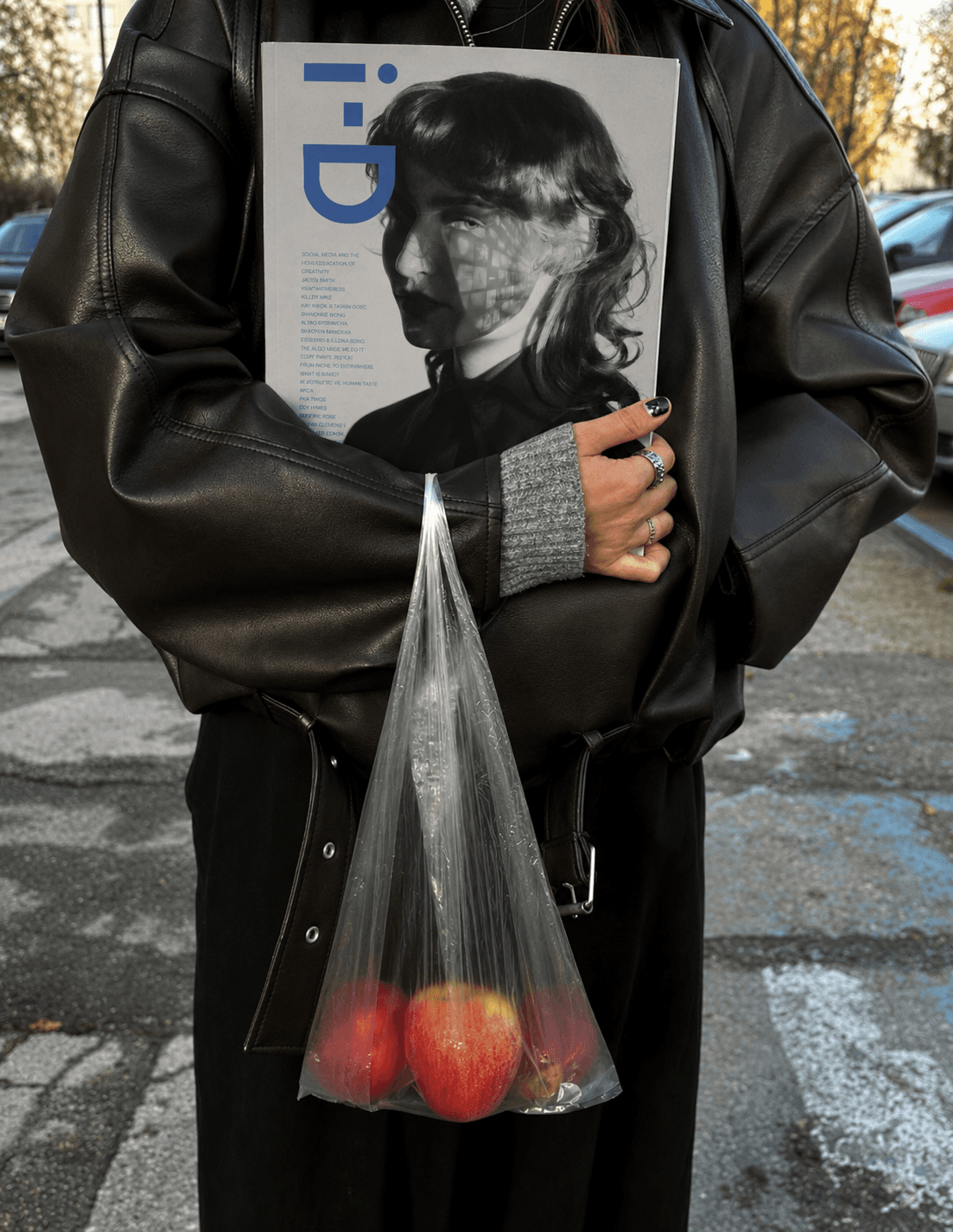
I developed a visual language that places photography inside a digital environment. Black-and-white imagery was layered with screen-based textures and interface elements to create the feeling that each image exists within a constantly mediated space.
A familiar Apple-inspired blue became a recurring accent, referencing the visual language of mobile technology while suggesting the comfort, familiarity, and dependency associated with our devices. I used the contrast between blue and desaturated imagery to distinguish digital space from the physical world.
For the cover, I created a duplicated facial reflection to represent the relationship between physical identity and its digital counterpart. The secondary face is filled with fragments of screen imagery, suggesting how the content we consume can become embedded in our thoughts and subconscious perception. Light and shadow further reinforce the tension between digital stimulation and the desire for clarity.
Across the spreads, I continued this idea of fragmentation and distraction. One composition places a subject within a busy urban environment while their attention remains fixed on their phone, visually separating them from the world around them. Typography follows the clean, familiar language of digital interfaces, creating continuity between the subject of the article and the medium through which it is experienced.
Result
The final editorial creates a visual representation of what it feels like to experience the world through a screen: fragmented, mediated, familiar, and increasingly difficult to separate from reality.
By borrowing the visual language of mobile technology rather than simply depicting it, the design becomes part of the critique itself. The project demonstrates how an editorial concept can extend beyond the written story, using visual systems to make an idea felt as well as understood.
Credits
Image Treatment & Editing: Natasha Lewis
Article: Natasha Lewis
Source Photography: Nick Fancher, & Raymond Okoro